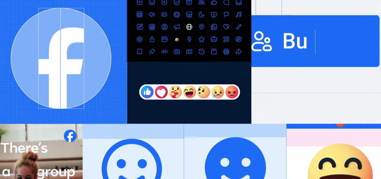
Facebook launched the first phase of its refreshed identity system.
The company has 3 key drivers behind the evolution of its brand identity design:
- Elevate the elements of their brand to create a distinctive, refreshed look.
- Unify how the brand comes to life across product-to-marketing experiences.
- Create an expansive set of colours — anchored in their core blue — that is comprehensive and vibrant, and also designed to be more accessible for people.
The intention is to create a refreshed design of the Facebook logo that is bolder, electric and everlasting.
“Each of the distinctive, new refinements drive greater harmony across the entire design as a key element of the app’s identity,” says Facebook.
This was possible by incorporating a more confident expression of Facebook’s core blue colour that is built to be more visually accessible in the app and provide stronger contrast for the “f” to stand apart.
“The goal of our work was to expand upon our foundation and create the defining mark of our brand that anchors the identity system across Facebook.
“We wanted to ensure that the refreshed logo felt familiar, yet dynamic, polished and elegant in execution.
“These subtle, but significant changes allowed us to achieve optical balance with a sense of forward movement,” says Dave N. Director of Design, Facebook.

The redesign of the wordmark and logo was to create a consistent treatment and improve overall legibility across Facebook.
Similar to the changes to the logo symbol, these refinements are to build upon the heritage of its identity, while creating a stronger relationship between how the wordmark pairs with the rest of the typeface.
In addition to the logo, a new colour palette was also developed.
A new set of hues, tones and contrast ratios that felt unique to the Facebook brand and are optimised for accessibility.
Blue, unsurprisingly, remains the foundational colour, and pairs with the expanded spectrum to create stronger distinction for Facebook in marketing and when speaking to people in the app.
The tonal range of secondary blues allows for flexibility while providing balance as a single expression of the brand identity.