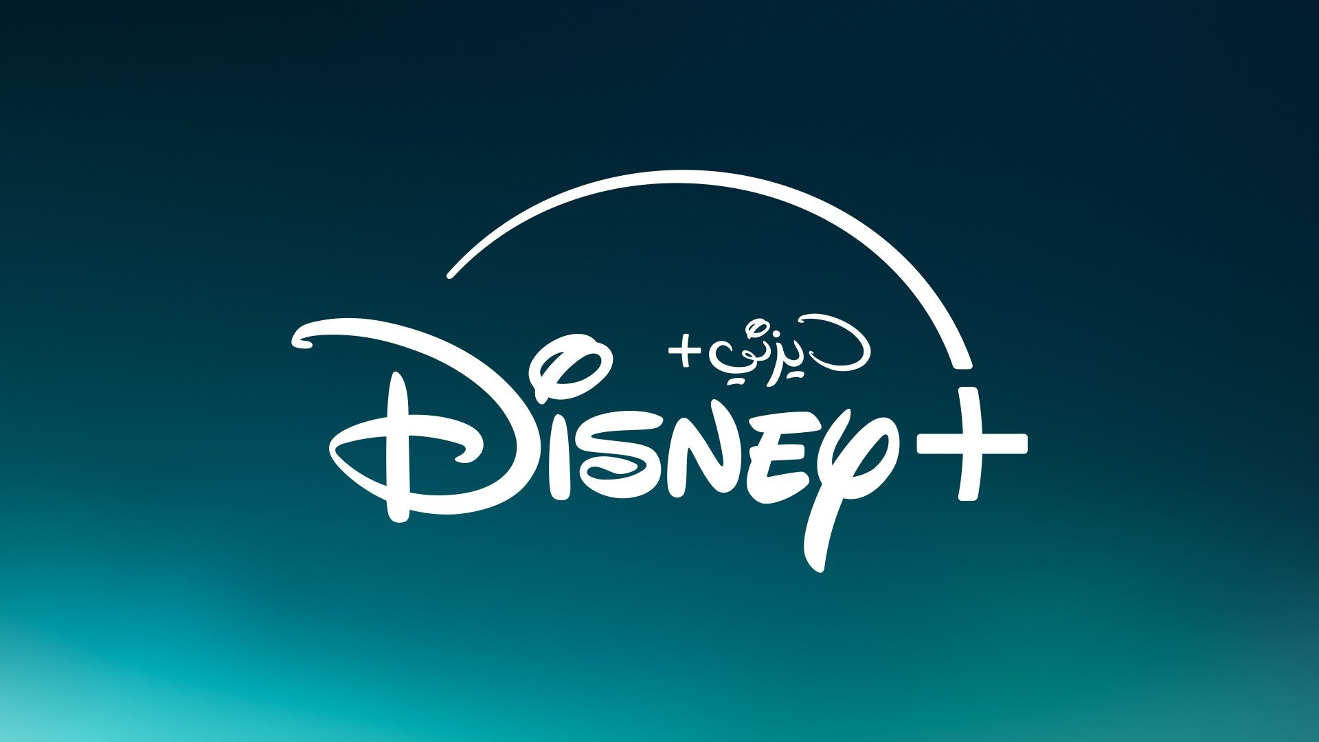
Disney+ has revealed a refreshed brand identity across its platform.
The roll out of the refreshed branding for Disney+ includes a refined logo, color palette, and an orchestral mnemonic created by Academy Award-winning composer Ludwig Göransson.
The streaming platform’s new logo makes a departure from a dark blue background and moves into a blend of green and blue background.
The reveal of the new logo follows the Disney’s acquisition of US-streaming website Hulu.
The new design was revealed on the same day as the global launch of Hulu content on Disney+.
The new logo evolution blends Hulu’s signature green into the legacy Disney+ blue, creating a “premium and elevated” feel to welcome Hulu on Disney+ and “mark a new chapter” in storytelling for the streaming service.
The updated logo in the MENA region also showcases the addition of the words “Disney+” in Arabic.
The Arabic script is a “clear demonstration” of the brand’s commitment to the region and is part of the brand’s mission to connecting with its regional audiences.

