Companies For Good – which helps businesses organise successful team-building activities, support their communities, protect the planet, and make organisations sustainable – has unveiled a full rebrand in the form of a bold new brand identity, brought to life in collaboration with creative agency Among Equals .
Built entirely on the real life impact Companies for Good has achieved after eight years and 100,000 hours of measurable impact, the brand has unveiled an identity that matches the scale of what it has achieved along with its partners.
The brief of the rebrand was to evolve, not erase: keep the brand’s heart, amplify its voice, and make impact the organising principle of the identity.
Objectives of the Companies For Good rebrand
The goal was to move towards a bolder, brighter, future ready brand that positions Companies For Good as the region’s go-to partner for businesses that want to do good, making it easier to turn good intentions into meaningful action.
As such the rebrand was developed by creative agency Among Equals, who managed the full process from strategy and positioning through to identity, design and rollout.
Building on the brief, the agency decided to ground the new identity in real impact, transforming CFG’s data into patterns, colours and stories that make their purpose visible.
The result is more than a design update; it is a bold brand world that reflects eight years of measurable change and sets CFG up for the future.
The new identity is being rolled out across every touchpoint, from the website and social channels to newsletters, brochures, t-shirts, flags and event banners.
The aim wasn’t a single reveal moment, but to create a cohesive new brand world.
The rebrand was designed with two key audiences in mind.
- Businesses across the UAE, from large corporations to SMBs, who want to do good, and want the easiest, most engaging way to make it happen with their teams.
- Partners who deliver activities in partnership with Companies For Good and need a brand they’re proud to stand alongside. The new identity strikes the balance: credible and trusted for corporates, yet vibrant and fun like the activities and experiences Companies For Good offers.
As a result of the rebrand, wherever clients, partners or volunteers encounter Companies For Good, they now have the opportunity to experience a bold, unified identity that makes its mission and impact instantly visible.
Rollout of the rebrand
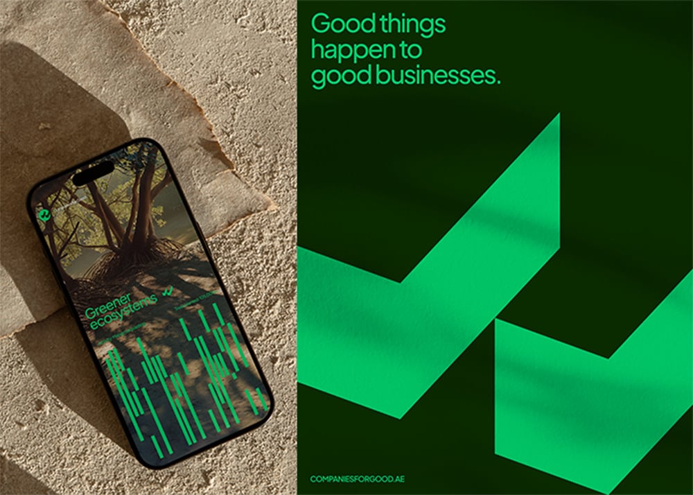
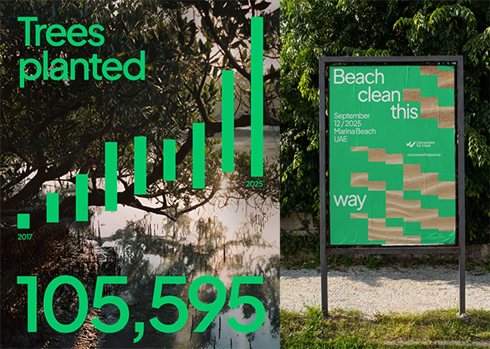
The rebrand included a refreshed logo, a new colour palette, typography system, and a suite of brand assets.
These were applied across digital platforms, client decks, merchandise and event collateral.
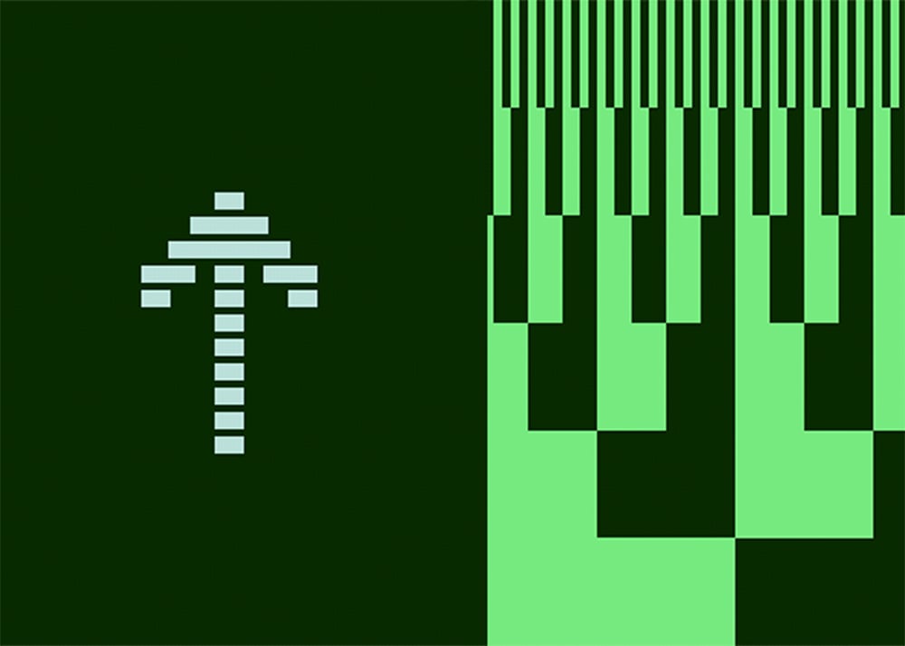
CFG’s tick logo was kept as a recognisable anchor, but the new identity builds a richer brand world around it.
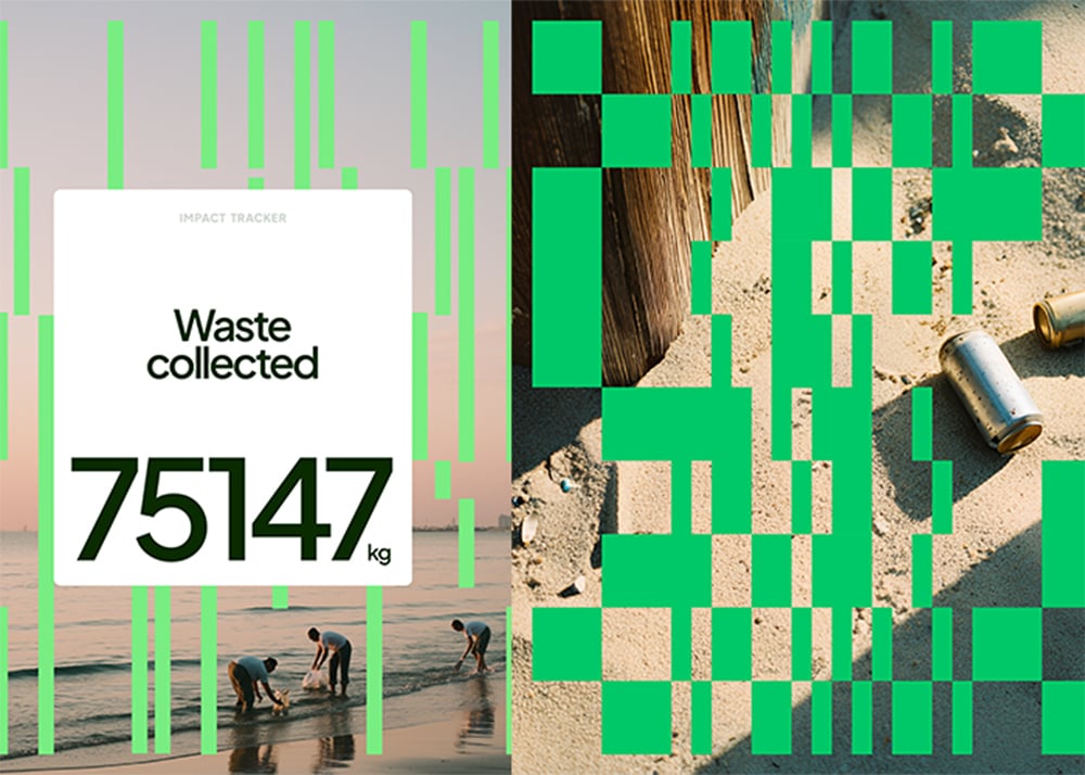
Every element is intentionally built directly from real impact: trees planted, waste collected, CO₂ reduced, and children empowered.
Those numbers were transformed into data-driven patterns that echo infographics and impact charts, turning raw metrics into visual symbols of progress.
Among Equals leaned into a vibrant colour palette inspired by the optimism and energy of CFG’s activities, paired with modern, confident typography and photography that celebrates real people in action, ensuring the brand shows up with clarity and energy everywhere from a social post to a t-shirt on the beach.
The result is an identity grounded in real-world impact, designed to carry CFG into its next chapter of growth.
CREDITS:
Client: Companies for Good
Agency: Among Equals