IPG-creative shop MullenLowe has revealed its new brand identity. Taking on its iconic challenger Octopus, the brand reimagines its logo to be “alive”. According to MullenLowe, the new logo “doesn’t live by the rules of logic”.
The rebrand project was carried out by the MullenLowe US office and led by head of design, João Paz. It aims to rethink how “agencies show up in the world”.
It sees the agency move its trademark octopus from a mascot to a model for “how brands should behave today.”
Kristen Cavallo, CEO of MullenLowe Global, said, “Our icon offers the perfect metaphor. The octopus has survived over 300 million years precisely because of its fluidity and ability to adapt.”
MullenLowe sees the octopus evolve from an operational mascot to a kindred spirit that visually represents how brands need to grow today.
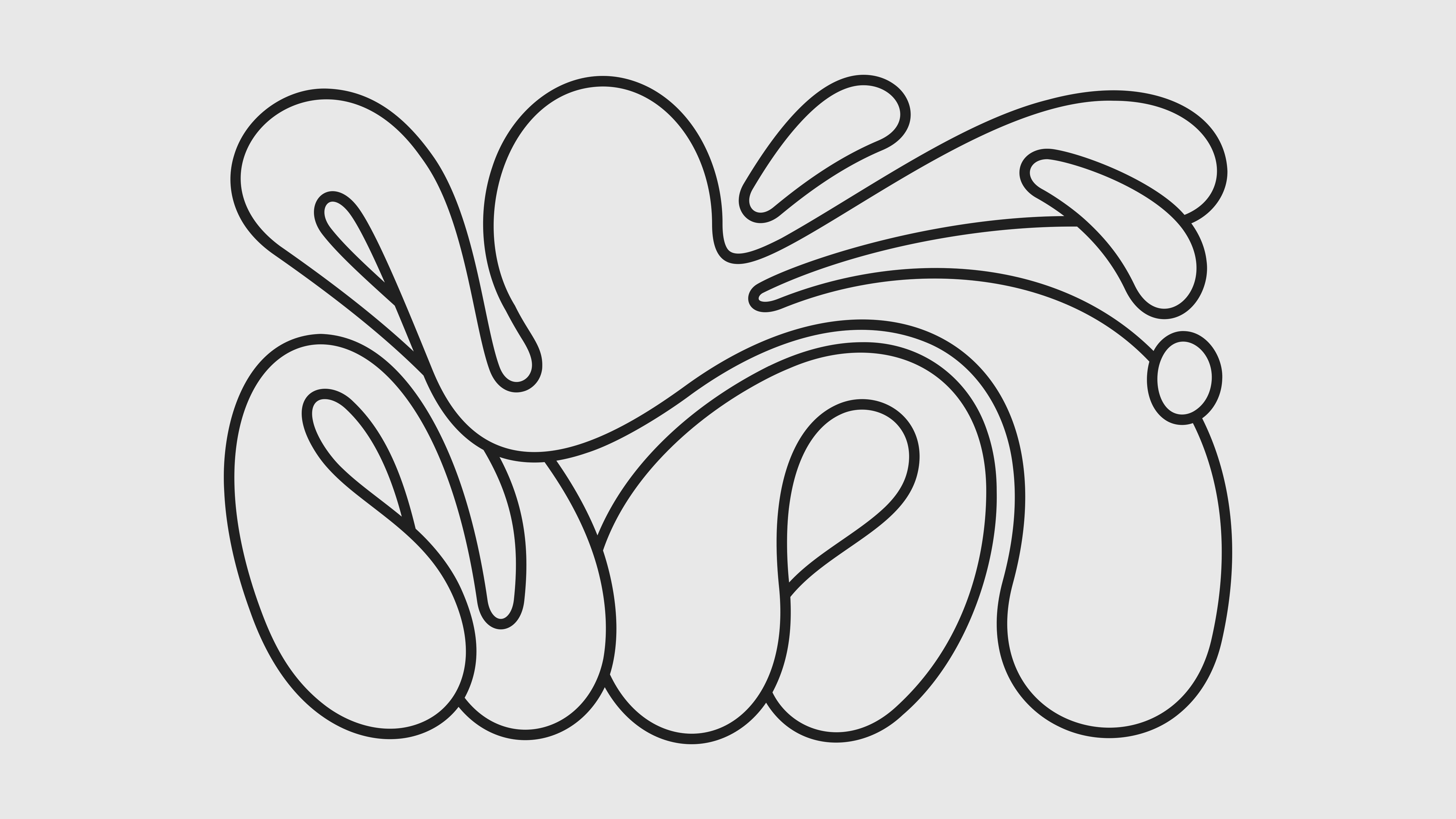
The new logo for the agency loses the boxing gloves, which once signified its “hyperbundled” offering and risk-taking attitude, to opt for an asymmetrical and fluid version of the sea creature.
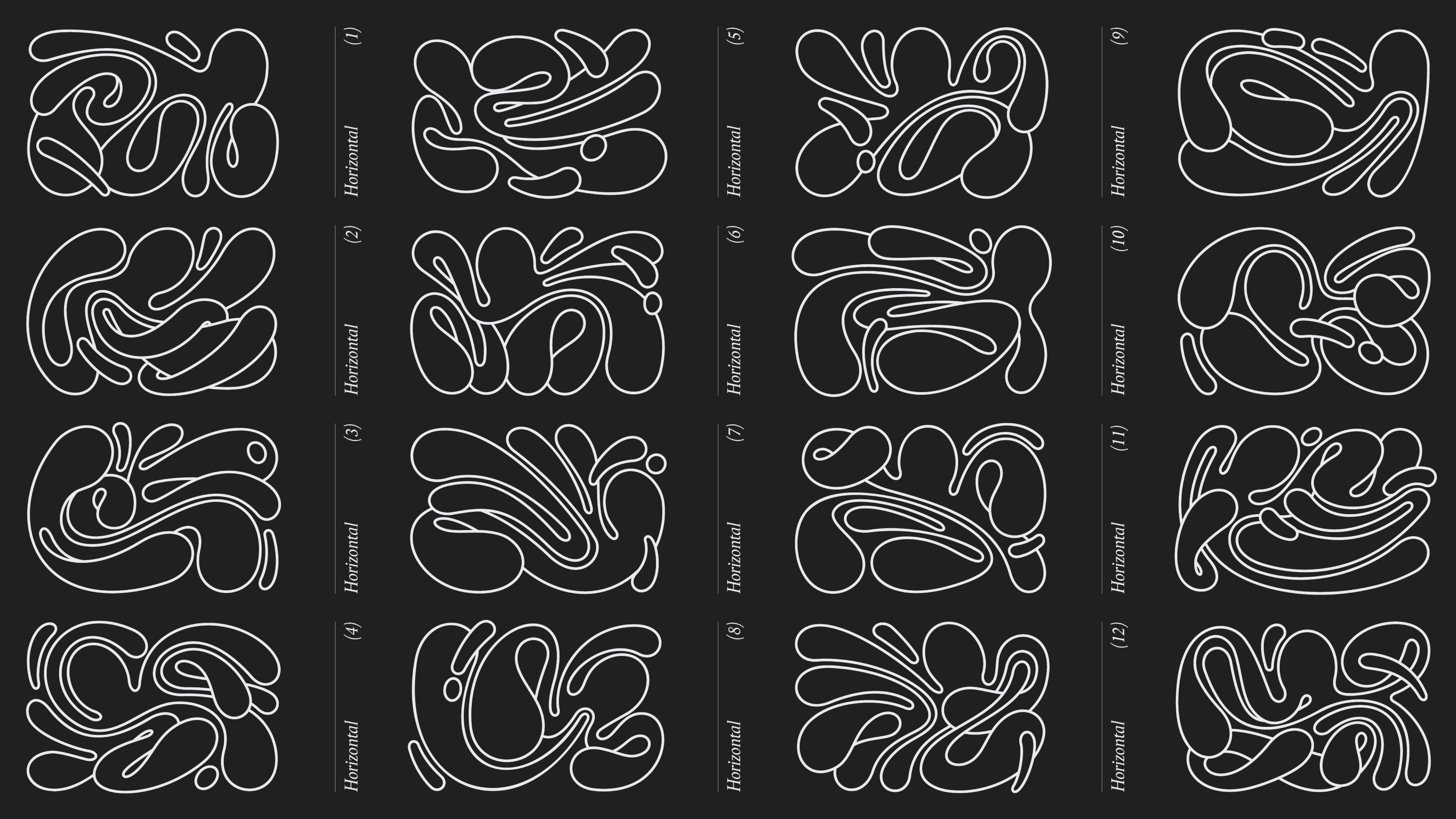
It places a strong emphasis on the concept of fluidity through an identity that’s constantly changing and personalised to each person. The design created has the ability to move and change in different ways.
Matthew Butterworth, Regional Managing Director of MullenLowe MENA told Campaign, “The identity is perfect for our positioning, of never standing still and always challenging the status quo. Given the fluidity of the design, it showcases our strengths in this new world of creativity agility, in how we can flex, change and adapt to any given situation.”
The design pattern also aims at showcasing the inclusivity and uniqueness of the talent in MullenLowe collectively.
To showcase this, the agency created a generative app that will enable its employees to personalise their very own octopus for all brand collateral including email signatures. Paz said that this move would allow MullenLowe’s employees globally to “make their own mark” in the company.
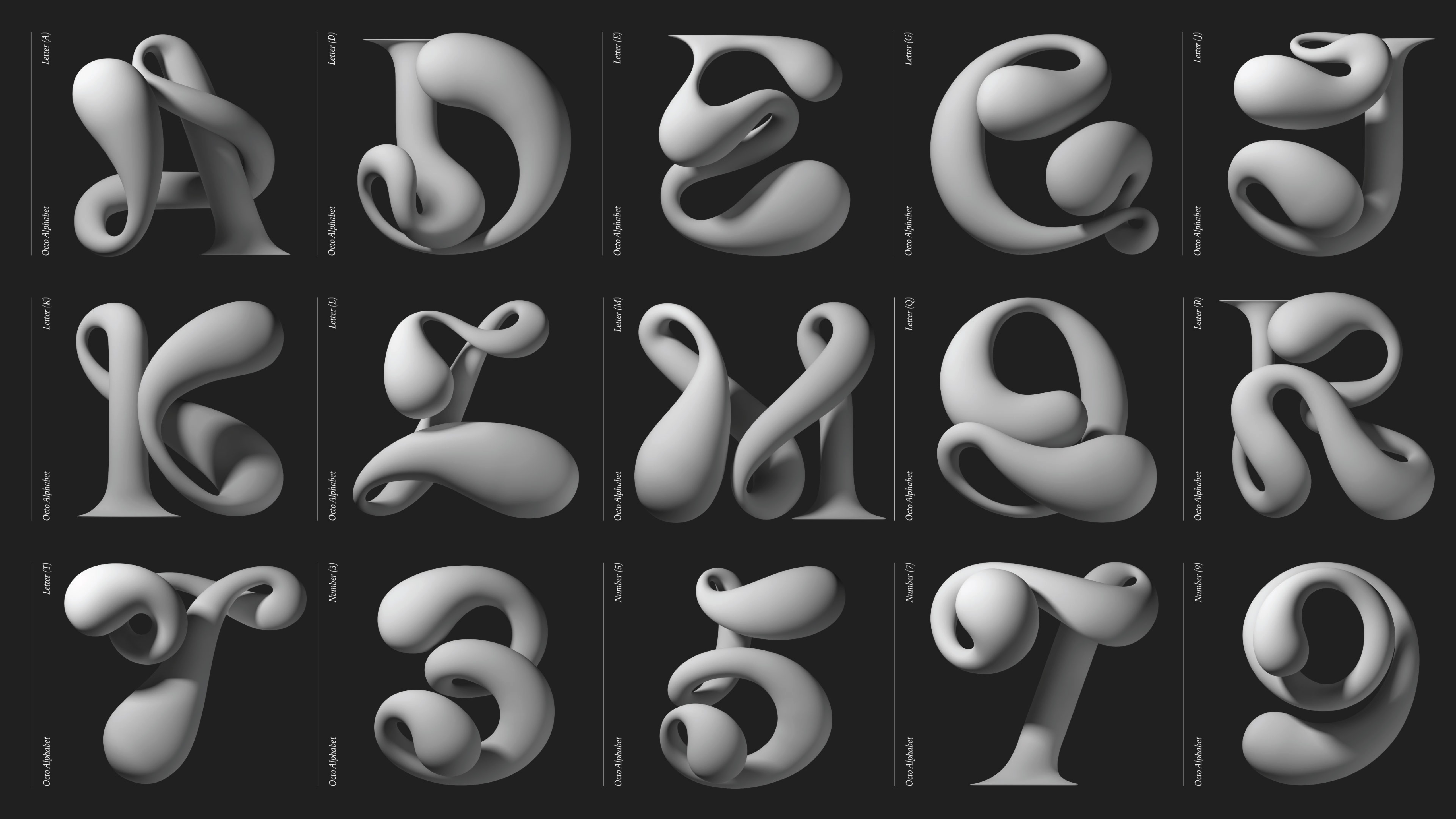
Also part of the rebrand was the creation of the agency’s alphabet typeface inspired by the Octopus’s tentacles.
The agency last rebranded in 2016 with its challenger octopus, following the merger of US-based Mullen agencies with creative network Lowe and Partners. The previous rebrand was carried out by the South American agency, MullenLowe Brasil.