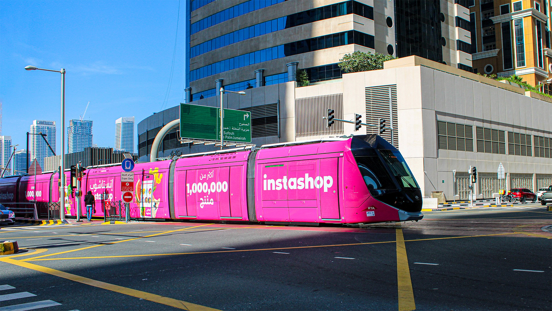
To reveal its new visual brand identity, instashop donned its new look on the Dubai Tram this month, reintroducing the online grocery delivery service to the public in a powerful and memorable out-of-home (OOH) campaign.
The rebrand was driven by the company’s evolution over the years, and its commitment to delivering an even better experience for customers in the UAE. To reflect this, instashop has refreshed its look and feel, with the intention to be modern and dynamic.
The rebrand also aims to boost brand visibility by being more recognisable and align with instashop’s mission to provide consumers with convenience and variety at their fingertips.
“Over the years, we’ve grown from being just a grocery delivery app to a multi-vertical marketplace, offering everything from pharmacy essentials to pet supplies, flowers, and even fashion,” said Aleksandar Derbogosijan, Creative Director & Brand Architect, instashop. “It was important that our brand identity reflected this transformation.”
“Strategically, this helps reposition instashop in the minds of both customers and partners: not just as a convenience app, but as a lifestyle platform that understands and serves the evolving needs of everyday life. The identity supports our broader goal of building long-term brand equity while signaling that we are progressive, locally rooted, and continuously innovating,” he continued.
To craft this new look, instashop’s strategy was to create a unified, ‘future-ready’ identity that reflects who the company is today and where it’s heading as a brand.
“We evolved from a grocery delivery app into a multi-category platform, so our visual identity needed to catch up with that growth,” Derbogosijan said.
He added: “One of the key decisions was removing the basket icon, which had become a visual shorthand for grocery shopping. While it served us well in the early stages, it was also limiting, anchoring the brand to one vertical and no longer representing the full breadth of what instashop offers.”

From a design system perspective, the team at instashop focused on building an identity that is clean, scalable, and adaptable across digital and physical environments.
“The refined typography brings clarity and approachability, while the new iconography, more abstract and dynamic, reflects motion, convenience, and agility, rather than a single category,” Derbogosijan explained.
“Together, the logo and broader visual system (including color palette, grid structure, and iconography) create a flexible brand architecture that can support every vertical, strengthen brand recognition, and prepare us for future expansion without losing consistency,” he said.
Crafted ‘100 per cent in house’, instashop revealed its new brand identity with an OOH campaign leveraging the Dubai Tram to be the central anchor of the larger brand moment.
“The tram was a strategic highlight because it symbolises movement, accessibility, and the rhythm of everyday city life, all values that resonate with our brand,” Derbogosijan said.
“We wanted to move beyond a digital rollout and paint the town pink, to spark curiosity, drive conversation, and visually communicate that we’ve grown into something much bigger than a grocery delivery app. This campaign wasn’t just about a new look, it was about reshaping perception and clearly positioning instashop as a modern, multi-category lifestyle platform,” he added.
View this post on Instagram
Derbogosijan also claimed that the initial response to the new logo has been “overwhelmingly positive”.
“We also received positive mentions on social media, where users have embraced the new look, sharing their excitement and recognition of the transformation,” he said.
While the roll out of the company’s new visual identity is still in early stages, Derbogosijan said “the results validate that the rebrand is resonating with our target audience and reinforcing our market position.”
“As we continue to measure, we’re confident this will have a lasting impact on brand perception and customer loyalty,” he concluded.