PR agency APCO has launched a new brand identity as part of its 40th anniversary celebrations.
The rebrand will see APCO drop Worldwide as part of its name and logo. According to the company, the step has been taken since APCO has established a “significant global presence”.
It also mentioned this will “reinforce that actions speak louder than written words and promises”.
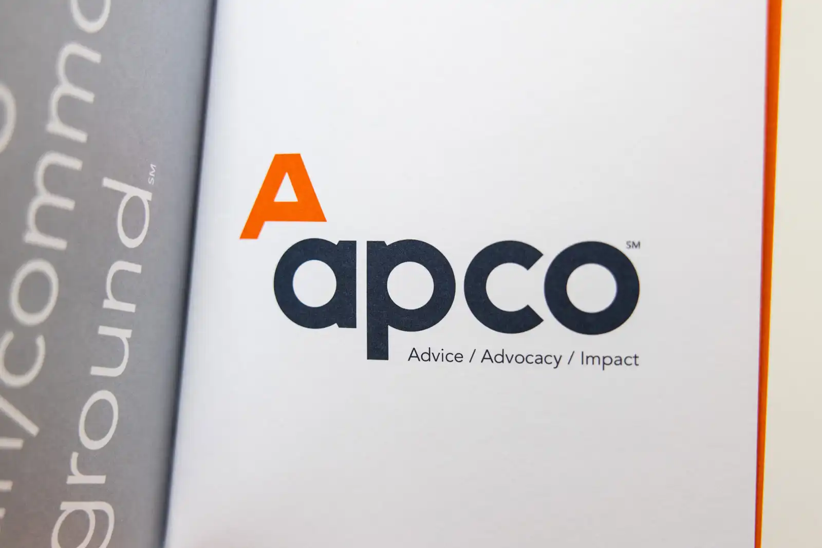
The new logo will have two sides.
The Uncommon A—the new symbol that accompanies APCO’s logo—symbolises the “uniqueness” of APCO’s offer.
And on the other side, it features the traditional side of the logo.
The older side hopes to reflect where APCO came from and where it is going, and the stability and sound advice that APCO has historically offered to clients.

The logo also removes one of the A’s legs to showcase “the uncertain times in which we live and the search for creative solutions that empower the transformational change and the progress clients seek to make.”
“Demonstrated by our 40-year record of impactful work for clients, our team’s diverse and relevant expertise and knowledge, and integrated approach and capabilities, APCO has a special and authentic culture and character, bolstered by our people, that inform and enable our perspectives and work,” said Founder and Executive Chairman Margery Kraus.
“I am proud of what we have achieved and excited about how our new brand reflects our heritage while representing where we are going in the future and the legacy our organisation is creating,”
“The new brand reflects APCO’s 40-year journey of boldness and courage, overcoming hurdles by drawing on our diverse team’s insights and expertise,” CEO Brad Staples said.
“Guided by our values as well as the commitment, collaboration and determination for our work, APCO continues to pursue unconventional solutions and seek uncharted achievements for clients around the world.”


