Spatial trends come and go, from the era of ultra-minimalism to the retaliation of expressive maximalism. Among these trends, one has notably captivated attention by using a refined colour palette.
This ‘mono-colour’ approach provides a strong sense of place, visual storytelling and most importantly brand.
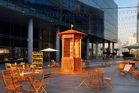
While this is becoming popular with all kinds of brands, its prominence is most pronounced within the realm of luxury maisons.
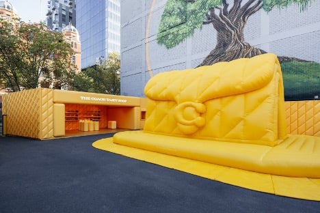
In the world of luxury branding, colours play a pivotal role in creating an indelible impression on consumers’ minds.
The most famous luxury brands are distinguished not only by their products but also by their recurring colour codes. Even if you are not a luxury lover you can still recognise the iconic Tiffany blue, Cartier red, Hermès orange…and so on.
Don’t miss Campaign in Saudi Arabia. Join us at our Campaign Saudi Briefing 2024: Talent and Technology taking place this Thursday, May 30th at Holiday Inn Riyadh, The Business District, Saudi Arabia. Click here to buy tickets
From a design point of view, these monotone spaces present a unique opportunity to play with form, textures and composition to create an impactful space that doesn’t feel stale.
The cohesive atmosphere allows for showcased products to stand out without distraction, creating a feeling that you are stepping into the world of the brand.
A takeaway for us is not to underestimate the power of colour. We see how luxury brands are successfully implementing this trend not only for aesthetic purposes but for creating powerful links that distinguish brands from each other.
So next time your eye catches an impactful mono-color display, ask yourself why this was chosen by the brand and what message they are communicating to us.
By Yoana Zaneva, Strategic Planner, Auditoire | Luxury Makers by Auditoire