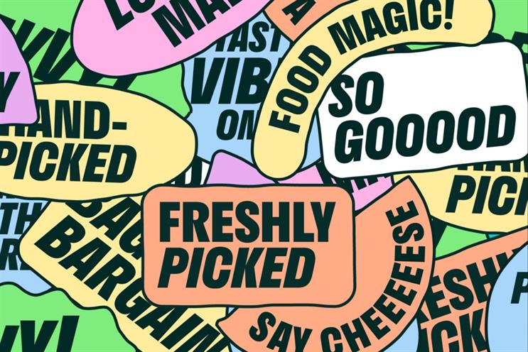
Deliveroo has unveiled its first brand refresh since 2016, created by its in-house creative agency Deliveroo Creative.
The food delivery brand said the refresh aims to ‘drive greater distinction and creative consistency across its 10 local markets’.
Deliveroo Creative spent eight months using customer research to help create the revamped “playful” identity and generate 400 assets.
The team identified what visual elements people recognise most about the brand, which were the colour teal, the Roo head shape logo and the Deliveroo wordmark.
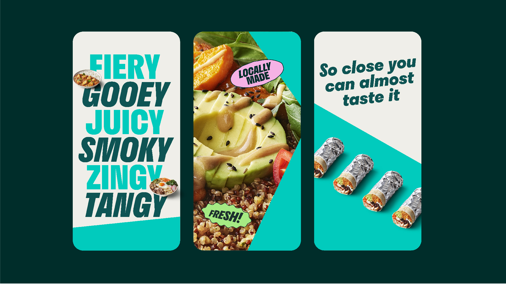
The Roo Head inspired the entire brand identity, building on DesignStudio’s 2016 rebrand, with the typography at an angle of six degrees, the same as the nose of Roo head.
Deliveroo has also introduced the ‘Rooute’, inspired by the rider’s teal journey line, which appears the moment a customer makes an order and tracks the rider on the app.
The ‘Rooute’ takes inspiration from the angles of the Roo head, twisting and bending in the same way.
Deliveroo Creative also aimed to create a more cohesive customer experience from advertising to the Deliveroo app, while taking into consideration how the brand’s new positioning influenced the creative.
Emily Somers, global director of brand and creative at Deliveroo, said: “Our in-house talent, combined with knowledge of the brand, meant the team were perfectly placed to develop a brand identity – flexible to the needs of the entire global organisation – including our external agency partners.”
‘Eight months may seem like a long time, but it meant we could build something that works for everyone and something all of Deliveroo can be proud of.’
The new brand identity will launch this month and be rolled out in the coming months across all media and channels.
Paul Hewitt, global head of creative at Deliveroo, said: “This is the teal deal. For the first time since 2016, we have a consistent visual foundation for our creative campaigns. Our new work shows how much life is left in our most distinctive brand asset.
“Looking afresh and discovering new elements inspired by the Roo head has been a total joy to direct. Proof that sometimes the answer is staring you right in the face – literally.
“As a creative team, we are now brand guardians, which gives us a new role in the business. But we’re hungry for more and I’m excited to start to bring this work to life to keep Deliveroo looking smoking hot and tasty – around the world.”

